Check the AI-generated image’s main subject, small details, text, composition, and image quality. It should look correct for its display size and match the article.

AI-generated images are rarely flawless. It is expected that it may take 2 or more prompts to get the exact image we want, but the results can be far from expectations and absurdly worse sometimes.
It also happens that the image can look perfect, but it does not fit the real page. Wrong labels, inconsistent designs, unmatching editorial illustrations, and many errors can be spotted in an AI-generated image. So it is important to review the image before publishing it anywhere.
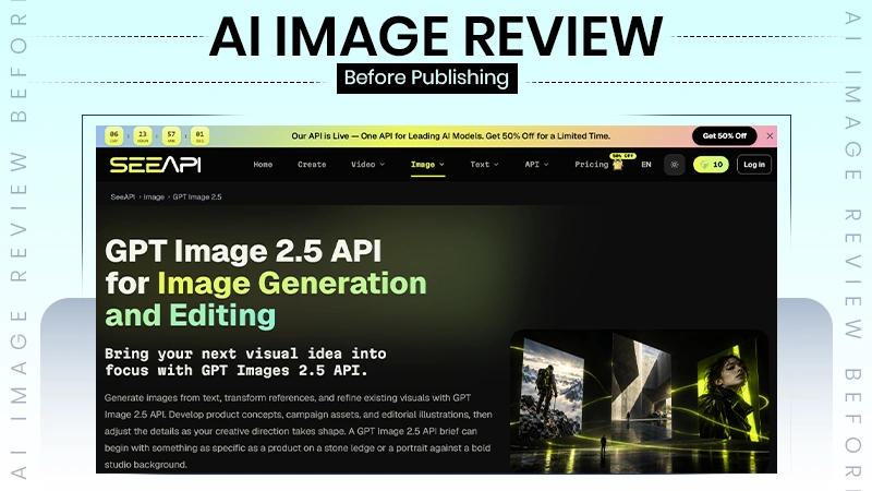
There are minor errors sometimes that can be fixed with just a controlled revision, and the Image 2.5 API does it seamlessly. When the image does not match expectations at all, it needs regeneration with a detailed prompt with definitions.
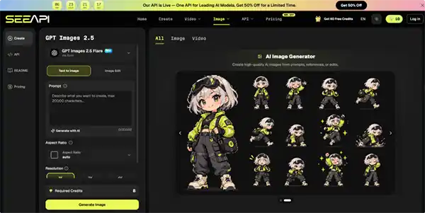
Review starts before generation. Write a one-sentence job description for the image: “show a compact red backpack in an autumn hiking setting with space for a headline on the left,” for example. That sentence gives you something concrete to compare against later as creators create in AI avatar generators.
Any eye-pleasing result can feel acceptable even when it does not support the page without such conditions
Divide the requirements into two groups.
The first contains elements that must remain correct, such as product colour, facial identity, object count, orientation, or room for copy. The second contains flexible elements, such as background texture, cloud shape, minor props, or decorative lighting.
This will help the reviewers to treat the minor errors of the image alongside the doing harmless variations that still has to be polished.
A useful review works better in passes than as one long impression. Each pass asks a different question, so a visually striking image cannot hide a factual or compositional problem.
Look at the subject before the background. If it is a product, compare silhouette, colour blocks, visible parts, logo placement, and proportions with the reference. If it is a person, inspect hands, teeth, glasses, earrings, clothing edges, and other repeated details. For an illustration, confirm that the central object or action actually represents the idea the image is supposed to communicate.
Minor errors do not make an image a failure. Focus on details that are changing the identity, meaning, purpose, or credibility. A slight color effect can be accepted, but misplaced facial features or a table with an uneven leg is not.
Zoom in. Generated text on signs, packaging, screens, book covers, or clothing can appear convincing at normal size while breaking apart under inspection. Check numbers as well, especially dates, prices, interface labels, and measurements. If the image does not need text, removing or obscuring it may be safer than trying to make decorative lettering carry information.
Small repeating structures also deserve attention.
The eye usually skips inconsistencies in shelves, window frames, tiles, cables, chair legs, and jewellery during a quick scan. But those errors should not be amplified at the final display size.
Place the image into the actual ratio or layout before approving it. A wide website hero, square social post, and vertical story can make the same source image behave very differently. Important faces or products should not sit so close to the edge that responsive cropping removes them. If a headline will appear beside the image, check whether the empty space is genuinely usable rather than filled with distracting objects.
Approving a composition in a large preview and finding the disappeared focal point later is the most common mistake this step spots.
Read the nearby headline, caption, or article section while looking at the image. Ask whether the visual supports that text without adding a claim of its own.
An illustration about online fraud, for instance, should not depict a real company or identifiable person as if they were involved. A health, news, or safety image should avoid visual details that could be mistaken for factual evidence.
The image passes when a viewer understands its role without forcing a result that the page is unable to establish.
When an image nearly works, broad rewrites often make the next version worse because they change several successful elements along with the failed one. Name the defect first. “Background too busy,” “subject shifted left,” and “jacket colour changed” are better revision notes than “make it better.”
For a controlled edit, use the ChatGPT Images 2.5 API when you already have a usable source and can state a narrow change. Supply the reference image, describe the element that should change, and identify what must remain stable—for example, replace a dark studio wall with a warm neutral background while keeping the person’s pose and clothing unchanged. After generation, compare the new result against the source specifically for those preserved details before judging style or polish.
If the first attempt missed the concept rather than one detail, regeneration is usually cleaner. A weak camera angle, wrong subject, or unsuitable scene means the foundation failed. Editing works best when the foundation is already right, and the requested change has a clear boundary.
First attempt usually does not provide the intended results, but it often provides a half-correct image with minor errors that can be fixed. Editing works best when the base is already supporting the image. Some requests and minor edits can bring the expected results.
Polished lighting and realistic texture can make reviewers less critical, so deliberately inspect the image in an unglamorous way. Shrink it to thumbnail size and identify the first thing your eye notices. Then enlarge it and scan the edges, background, and repeated shapes. Finally, view it for a few seconds without the prompt.
Sometimes the image generator relies only on your given details and does not think for itself about what you are willing to achieve; these problems can also be fixed by some simple considerations.
Pass the image if the main subject is recognizable, required details remain consistent, the crop preserves the focal point, and the image does not introduce unsupported information. Revise it if one of those conditions fails, but the basic scene still works. Regenerate it if the scene, subject, or viewpoint is fundamentally wrong.
Consider a product article that needs a header image of a reusable bottle on a desk. One result may look attractive but place the bottle behind a laptop, hide its shape, and fill the only headline space with plants.
The composition fails here at its placement requirements, so it is not a styling problem. A clean image with only essential points of attraction can do its work better than a cluttered image.
The fastest way to improve generated imagery is to stop treating review as an informal final glance. Keep a short check tied to the types of visuals you publish most often: subject accuracy, text, anatomy or object structure, crop, empty space, and consistency with the surrounding message. Add special checks only when the asset requires them.
Product images often require colour or shape comparisons, so editorial illustrations have to be checked specifically for misleading implications in many text-to-image AIs.
Over time, failed images become useful evidence. If the same problem keeps appearing, move that requirement earlier into the brief or reference selection instead of correcting it after every generation. Publishing quality improves when the process records what must be preserved, what can vary, and what causes an image to be rejected.
That changes the image-generating process from repeated guessing work to a controlled visual workflow where every revision has to make a better change, and every approved image has gone through a real quality check.
Check the AI-generated image’s main subject, small details, text, composition, and image quality. It should look correct for its display size and match the article.
The most common problems with AI-generated images are distorted objects, incorrect text, inconsistent details, unrealistic anatomy, and compositions that never match.
Edit the image if the overall composition is good and some minor errors have to be fixed. Consider regenerating the image if the whole thing is absurd.