Strong UI/UX design creates smooth user journeys that maximize engagement and retention. Effective UX strategies significantly reduce bounce rates and increase overall customer satisfaction.
People don’t usually notice good interface designs; what they actually notice is when something goes wrong. Facing issues with finding a settings page, managing how to control emergencies and an onboarding process that feels overwhelming.
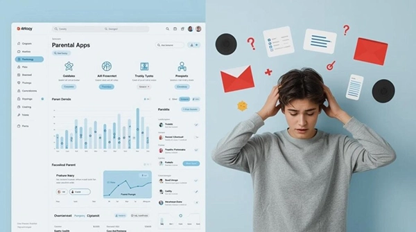
In family-focused products like parental controls and child safety apps, these small frustrations can have bigger consequences than simple inconvenience.
They can even reduce trust, lower engagement, and impact user safety. When designs work well, it stays invisible. When it doesn’t, the problems become impossible to ignore.
Key Takeaways
- Exploring why ux failures hit the bottom line harder than you’d think
- Understanding the safety dimension: when bad design causes real harm
- Seeing how trust as a business asset – and how design builds or destroys it
- Explaining how to design for the actual user – not the imaginary one
For businesses in the digital safety and parental control space, that trade-off bites harder than most.
A parent downloading a monitoring app isn’t browsing casually – they’re already worried about something.
If the onboarding confuses them, if the dashboard looks cluttered, if they can’t find the screen time settings without Googling it… they don’t complain. They cancel. Quietly, and usually within the first week.
In subscription-based safety platforms, losing someone in week one doesn’t just cost that month’s revenue – it costs the entire projected lifetime value of that customer.
Businesses that work with top UI UX agencies understand this math.
They’re not commissioning design work for aesthetics – they’re buying back churn, credibility, and compounding retention that shows up in quarterly numbers.
This is where the conversation shifts from business metrics to something more serious.
A confusing food delivery app might result in the wrong order. In a parental control platform, poor design can mean missed alerts,untracked locations,or tracking locations,or safety settings that aren’t working as parents expect.
The stakes aren’t equivalent, and the design standards shouldn’t be either.
Patterns that create safety gaps in poorly designed platforms:
Every single one of these is a design decision. Every single one is fixable. And none of them requires a complete product rebuild – just earlier, more honest attention to how real users actually behave.
Here’s something that sounds like neuroscience because it is: the Nielsen Norman Group found that users form a credibility judgment about a digital product within 50 milliseconds of landing on it.
Before they’ve read a word. Before they’ve clicked anything.
The visual design and layout – colour, spacing, typography, hierarchy – trigger an immediate gut response about whether this product deserves trust.
A polished, thoughtful interface signals competence. Something thrown together signals that the team behind it doesn’t sweat the details. And if they don’t sweat the details on the thing users can see… what does that say about the parts they can’t?
The revenue mechanics of trust in subscription products:
Product teams tend to design for a fictional user – technically comfortable, unhurried, mildly curious about features.
Cognitive load – the mental effort a product demands – is one of the least glamorous and most consequential factors in UX.
Every redundant step, every vague label, every screen that requires interpretation is friction. And friction, for a stressed parent at 10 pm, is an exit.
Reducing cognitive load in practice means:
Products that don’t account for this are quietly excluding a meaningful share of their potential market – and usually don’t realize it until they look at the data.
Accessibility-first design tends to produce cleaner, simpler products across the board.
Higher contrast, larger interaction targets, clearer typographic hierarchy – these things help the low-vision user and the exhausted parent scrolling at arm’s length in equal measure.
It’s a rare case where the ethical choice and the commercially smart one are the same call.
In software, “technical debt” describes the compounding cost of shortcuts taken early. Design carries the same dynamic – just quieter and harder to trace back to source.
For early-stage safety-tech companies, that’s not an inconvenient statistic. It can determine whether a product survives its second year.
The tricky part: users don’t file tickets that say “your navigation model is broken.” They say “I couldn’t figure it out” – or they say nothing at all and just stop opening the app.
The signal is behavioral. That makes it easy to misread as a pricing problem, a marketing problem, a features problem. It often isn’t any of those things.
Teams that build even informal usability testing into their process – watching real users navigate the product, without helping them – tend to catch these issues before they become churn patterns. It’s not expensive.
Design is infrastructure. It’s not decoration applied after the real work is done – it is the work, at least from the user’s perspective.
In markets where families are making trust decisions about their children’s digital safety, the quality of that design is the quality of the product. Full stop.
The platforms that grow sustainably in this space aren’t necessarily the ones with the most features. They’re the ones that made those features findable, usable, and trustworthy to a tired parent on a Tuesday night.
Strong UI/UX design creates smooth user journeys that maximize engagement and retention. Effective UX strategies significantly reduce bounce rates and increase overall customer satisfaction.
Businesses that invest in UI/UX design for business growth see higher conversions, stronger customer retention, deeper brand trust, and greater operational efficiency.
A strong UI/UX design strategy makes your platform intuitive, enjoyable, and trustworthy. Visitors easily notice the difference between when something feels effortless and when something is purely professional.
UX designers ensure that every element of your product serves a purpose and enhances its usability. Their impact is huge, influencing the overall user satisfaction and success of your product or service.